

At Applaud, we specialize in crafting visually stunning apps using cutting-edge tools, always with the customer at the forefront of our focus.
Our expertise lies in mobile platforms, including iOS, iPadOS, watchOS, visionOS and Android. When we develop we leverage Swift, SwiftUI, and The Composable Architecture to develop robust solutions tailored to your needs.
When it comes to design, we utilize a range of tools such as Figma, Sketch, Photoshop, Cinema 4D, and Principle. Proficient in design systems, we craft them alongside your project, ensuring seamless integration. With a deep understanding of Apple’s HIG and Google’s Material Design, our designs feel native on both iOS and Android platforms.
Projects with us can span anywhere from a week to five years. Whether you’re starting from scratch or need targeted enhancements, we’re here to guide you through the journey. We thrive on projects that drive positive change, leaving a lasting impact on the world.
Operating remotely first, we’re available for in-person meetings in Stockholm, Sweden. Feel free to drop by our Stockholm office for a chat over a coffee! ☕️

Banter is an AI dating assistant that enhances your online dating experience. They came to us with a working prototype, and Max took charge of designing, well, everything. From the app icon to the main screen, loading animations, and App Store presentation. The app analyzes conversation screenshots and offers tailored reply suggestions, making it easier to keep the conversation flowing. Central to the design was the concept of a screenshot running through a device, generating the perfect love message. The App Store screenshots tell the story of a man struggling to get a date, who ultimately succeeds with a little help from Banter.
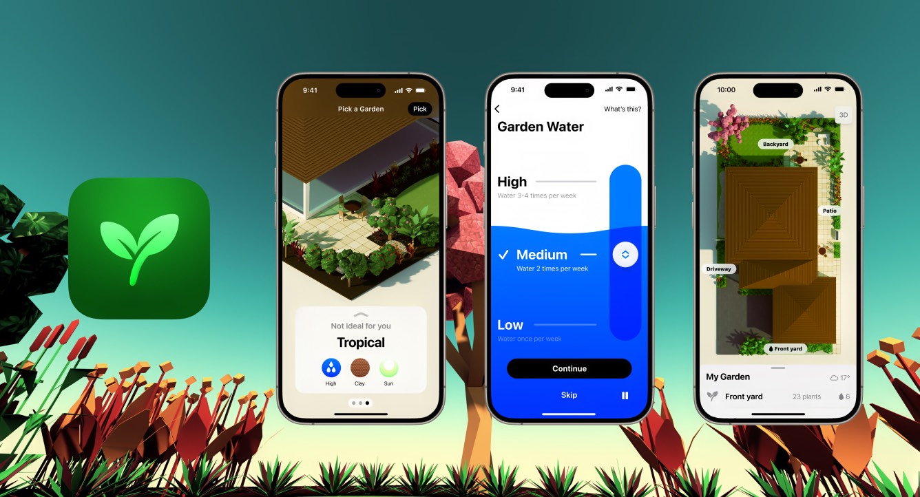
We were tasked with creating PlanningMyGarden's design for their apps for iOS and visionOS, and creation of all of 3D models. Flourish Garden for Apple Vision Pro lets you experience your garden with environmental sounds, life-sized plants and the sun setting right on the horizon. Flourish makes it easy get a professionally designed garden by providing a number of customizable themes that makes it easy to get started.
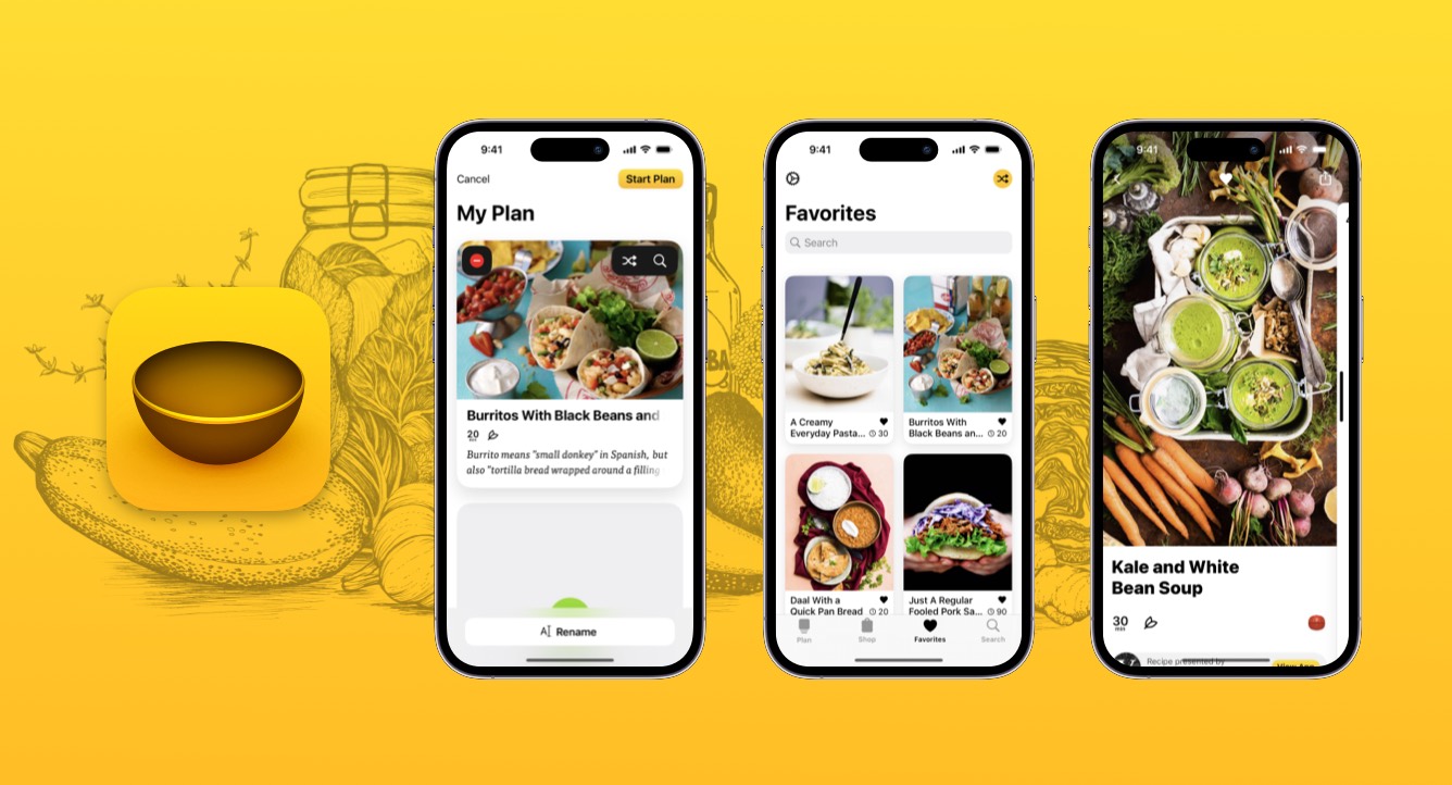
Plantry aims to make meal planning enjoyable by providing tools to plan, shop, and cook effortlessly. Whether you opt for a pre-made plan, customize it to your liking, or start from scratch, Plantry simplifies the process for you. We make a personalized shopping list based on your selections, and with over 1000 delicious recipes to pick from, you're bound to discover new favorites. Plantry is proudly crafted by Filibaba, a company co-founded by our team, dedicated to enhancing your culinary journey.
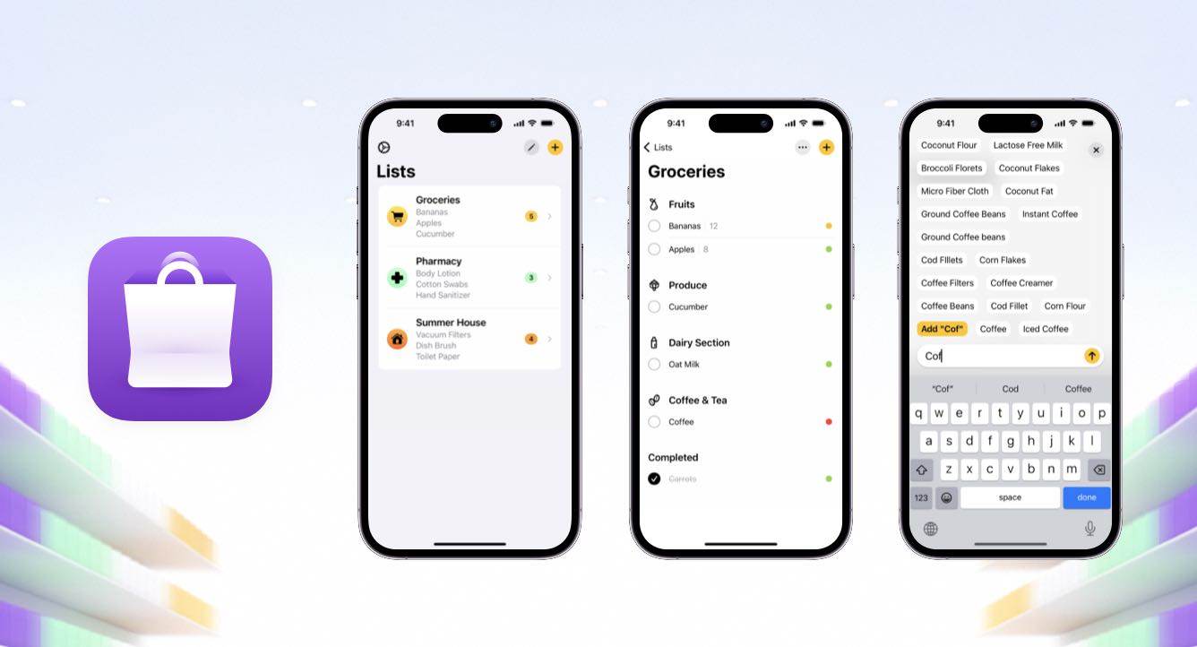
Handla boasts a vast built-in library of grocery items, simplifying the process of creating a categorized shopping list quickly and conveniently. Among its key features are the eco-conscious indicators, which subtly raise awareness about the environmental impact of your grocery choices. It's common for users to be surprised by the insights provided; what may have seemed sustainable at first glance could actually have a significant climate impact. Handla is committed to empowering users to make informed decisions that positively contribute to the world around us. Handla is proudly crafted by Filibaba, a company co-founded by our team, dedicated to enhancing your culinary journey.

During our collaboration on the new app for our client, Mind Vault, we designed an icon that, unfortunately, wasn't ultimately utilized due to the company's shift in direction, which even involved a name change! If we had proceeded with this icon, our focus would have been on further refining the MV word-mark for enhanced clarity and impact. A cool side effect of the word-mark: when the text is highlighted in macOS OCR recognition, it accurately identifies it as 'MV'.
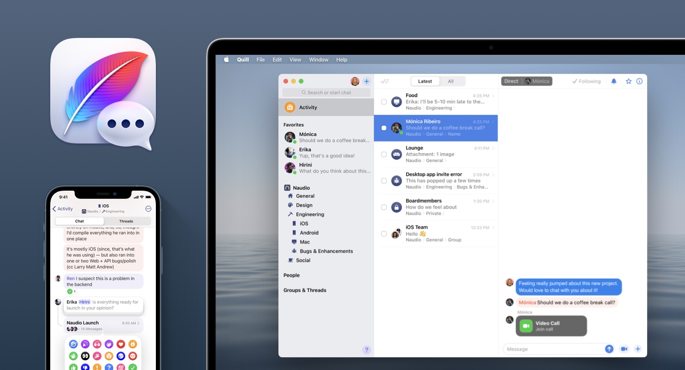
In 2020, Max joined Quill with the mission to enhance team communication. Quill was specifically designed to streamline your notifications, ensuring you receive only the most relevant ones, allowing you to focus on what matters most. With Quill, you could efficiently manage incoming conversations, prioritize the crucial ones, and peacefully disregard the rest. In December of 2021, Quill embarked on a new journey following its acquisition by Twitter.
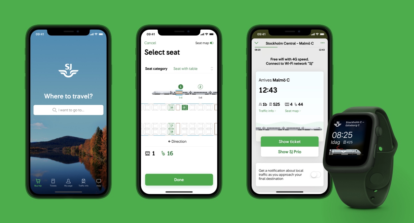
Between 2015 and 2020, Max was hired through Bontouch as the lead mobile designer to assist the state-owned Swedish Railways company in creating a top-notch app for iOS and Android, along with Apple Watch compatibility. This app allows users to purchase tickets and provides guidance throughout their journey while keeping them updated on traffic information. It caters to both commuters and those visiting friends and family, ensuring a seamless travel experience for all.
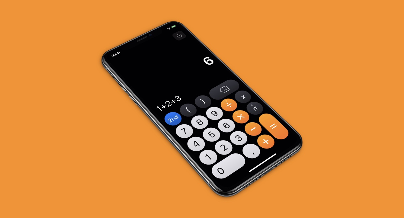
Our team had the opportunity to contribute to the design of a truly remarkable calculator. Our focus was on creating a user experience with incredibly satisfying button presses, achieved through animated tap states and haptic feedback. Every interaction with the calculator was designed to be both visually pleasing and tactilely satisfying, enhancing the overall usability and enjoyment of the app.

In 2013, our team helped conceptualize the functionality of Spotify Connect, their feature designed to seamlessly connect to a speaker or other devices and control playback regardless of the music's source. The logo we crafted played on the Spotify logo itself, with the concept that when connected, it would animate and fill in the circle. Our efforts resulted in a conceptual UI video that played a pivotal role in driving forward the design work for Spotify Connect.
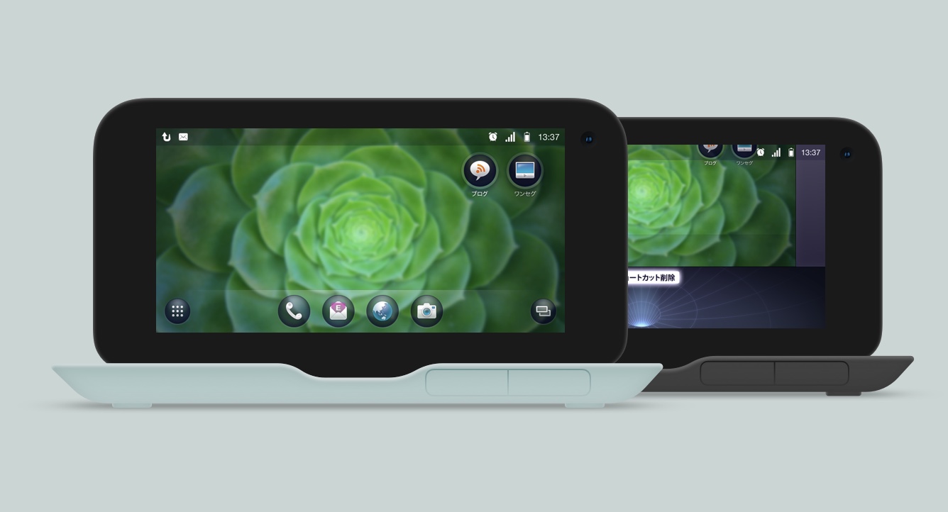
Back in 2010, during Max's time at Ocean Observations, he assisted the second largest Japanese operator in creating their suite of Android apps, which included a home screen and launcher. Max was responsible for providing visual design direction, conceptualizing ideas, and documenting for implementation. The IS01, designed by Naoto Fukasawa, was a unique blend of a smartphone and a laptop, inspired by food packaging aesthetics. The release of the IS03 phone was notably promoted by Lady Gaga and extensively showcased throughout Shibuya.